[I don't recommend reading all this. But I do recommend flitting down the yellow highlights.
If any of these assertions conflict with your understanding, stop and find out who's wrong! -FNC]
Predicting American ICU Saturation During COVID-19
![]()
Following
Mar 15 · 14 min read

This article is long, and for that I apologize, but we have a lot of information to cover if we’re going to accurately disaggregate the wheat from the chaff and tell you when to put your aging mom and dad in quarantine. Let’s begin.
Like everybody else in the free world, I’m obsessed with coronavirus. You are too, that’s why you’re reading this. It conjures a lot of very interesting thoughts in my mind, like this one:
Everyone’s yelling at everyone else about what the correct policy is, but the yelling isn’t ever going to stop because of the curious predicament in which public policy makers find themselves.
· If they institute Policy Measure X, and it still gets bad, then they will be publicly thrashed for not doing enough.
· If they institute Policy Measure X, and it turns out to be no big deal, then they will be publicly thrashed for overreacting.
· If they do nothing, and it’s bad, then they will be publicly thrashed for doing nothing.
· If they do nothing, and it’s no big deal, then they get to claim “I told you so.”
The only choice they have of the four possible options that doesn’t get them thrashed is to stick their fingers in their ears and do nothing, and see what happens. This is obviously the wrong thing to do, but this sort of analysis is probably weighing on every policy maker’s minds right now, from the world leaders to the school boards. It’s a real pickle. I have no answers for that. It may in fact have been exactly what happened in Italy.
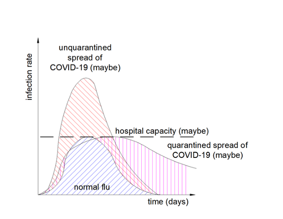
I sat down at my desk on the morning of Saturday March 14th, 2020, and started digging into the numbers, to try and project when the United States medical system was going to reach the breaking point like Italy. I did it so I could tell my family members what to do. What I discovered was curious, and somewhat non-narrative, and has a little bit of hope buried in the fear, so I felt I’d share it. I did this because this graphic flipped past my feed:
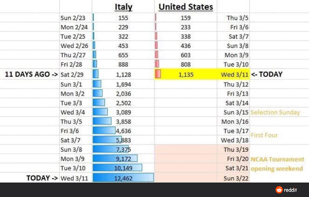
Reddit, the bastion gatekeeper of all academic sciences, propagated this very wrong chart. No we are absolutely NOT “11 days behind Italy.”
This is a neat chart, that shows some interesting stuff, but it’s misleading in several ways and brings us to inaccurate conclusions. And since I’ve seen it being shared by a lot of pretty smart people, I figured I’d tear it apart and rebuild it properly.
The implication of this graph is that we are going to be in the state that Italy’s in currently on March 22nd, with our ICU wards full and in triage, deciding who lives and who dies. That’s a bad conclusion because there’s a buried assumption in the graph that the United States has the same raw treatment capacity as Italy, without accounting for the relative population difference. This graph is not per capita.
It also doesn’t account for the true treatment limits. We shouldn’t be looking at total number of ICU beds, even on a per capita basis. We should be looking at the total number of available ventilators per capita with which the very sick can be treated. That’s the hard deck for when triage begins, and the very hard decisions start to be made, about who to just let die.
Gathering the Data
For all the wailing and gnashing of teeth over the United States healthcare system, our core infrastructure for critical care is world class.
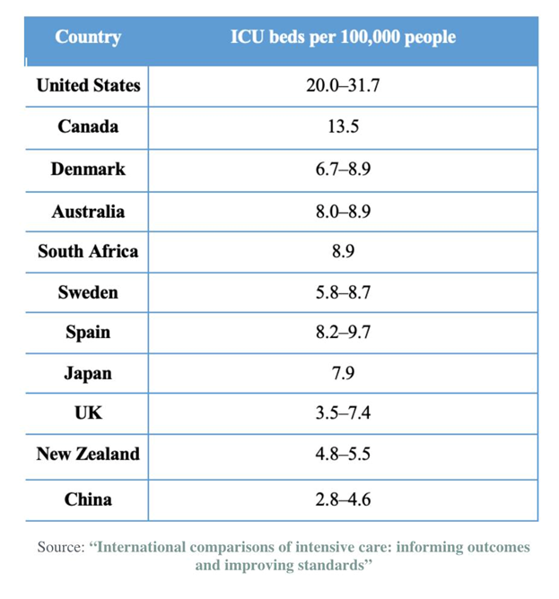
What matters in this case, though, isn’t beds, it is hardware. Treatment for the worst cases of COVID-19 requires ventilation. Everything coming out of Italy right now in the media is one resonant cry, “we need ventilators.” They have mobilized their army to try and build more ventilators.
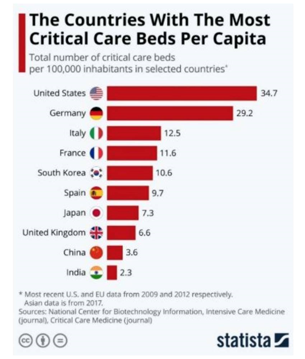
The United States has approximately 170,000 available ventilators with which to treat COVID-19 extreme cases. That’s a ratio of about 52 ventilators per 100,000 population. Not a lot, but it’s significantly more than any country in Europe. Germany is one of the most well equipped countries in the EU in terms of critical care infrastructure, and it has 25,000 ventilators. That works out to be about 30 per 100,000 population. The United States has almost twice as many as Germany, and probably the highest number per capita in the world.
How many does Italy have?
From the same link, Italy has about half the critical care beds per citizen that Germany has. It’s hard to know if the per capita number of ventilators scales with beds by their neighbor, but if so, then they likely have somewhere around 15 per 100,000. But if that estimate were true, then Italy would have around 9,000 ventilators, and they only had 10,149 confirmed cases of any severity on March 11, when the media reports about Italian triage started filtering in. That estimate must be far too high, unless they are either over-ventilating everyone or their infection rate is being misreported by a factor of 20.
If we were to presume that their confirmed case number reflected the actual infection rate, and they were only ventilating 5% of cases as China and other countries have done, then they would only need about 500 ventilators. That can’t be right. There are likely 3000 ventilators in Atlanta Georgia alone, based on US national averages.
Of all the media sources I could find on the number of Italian ventilators, the only one that gave a number was this one, which quoted around 3,000. That’s not very many at all. That would be about 5 per 100,000, about a tenth what we have in the USA. Maybe that’s the right number.
When we replicate the Reddit table above against World Health Organization (WHO) data, the data for Italy matches, but the data for the United States does not. It’s similar in some spots, but not in others, and doesn’t accurately represent the growth curves here. To be sure, some of our depressed numbers are absolutely related to poor testing procedures, but I’m not convinced Italy’s numbers don’t represent poor testing as well, given their reportedly early aloof attitude towards the disease. Let’s proceed presuming Italy early testing and USA early testing have the same sort of underlying failures, and do a real per capita, and per ventilator, comparison.
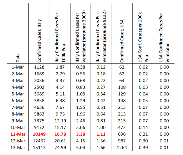
Here’s the reddit chart, fixed
Presuming Italy met their triage boundary around the 11th of March that would mean about 3.38 confirmed cases per ventilator if their ventilator supply was around 3000, and 1.11 cases per ventilator if their ventilator supply was around 9132. The 3.38 number makes more sense, because we know from Chinese experiences that not very many cases require ventilation. If true, that indicates that there was probably a tremendous per capita ventilator shortage in Italy prior to the outbreak, which is exacerbating their situation.
Extrapolating from these numbers, and further presuming that Italian screening is equally bad to US screening, we should expect to get into the “triage apocalypse” here around when we have 3.38 confirmed cases per ventilator, which is 575 thousand cases, or a confirmed infection rate of 0.17%.
That’s not very much.
We are definitely going to hit the triage limit if we use Italy as a modeling template, just not this month.
What Date is the Ventilator Apocalypse in the USA?
This is very difficult to answer, because Italy’s numbers on which we’re building our model aren’t real infections, they’re just the number of confirmed infections. They’re bounded by the availability of their testing, as are ours.
If we presume that the current cases aren’t testing limited, or that the ramp in increased testing over the infection here so far parallels the actual spread of the virus in an appropriate way, then we can use the last week’s rate of US propagation to project forward. That would be an increase of 1.33 times per day, or a doubling of cases every 2.4 days. We hit the limit somewhere about 20 days from now instead of 11 like the reddit graph is inferring.
First or second week of April.
Our cases may climb more rapidly than that, though, because our testing may ramp up faster than the disease ramps. And would this testing ramp be climbing faster, or less fast, than that in Italy, for our comparison to be useful? Once you throw testing uncertainty into the mix, the mathematics become basically undoable. If you throw in the fact that people in Italy literally kiss each other on the face when they meet, and are statistically the second worst nation in the EU at washing their hands, and are a more dense population than we are, the comparison becomes regressively undoable.

We also just implemented some very significant social distancing protocols last week, once we started freaking out about Italy, that are hopefully going to change our infection curve away from a doubling every 2.4 days to a doubling across a much wider time frame.
Geographical Variation of Critical Cases
Different areas of the country have higher population densities than others, different age profiles, and different health characteristics. A GIS nerd with a statistics degree could punch out a map of that, especially if they’re at Harvard. Several days ago this study did exactly that, in attempting to map likely COVID-19 hot spots in the US.
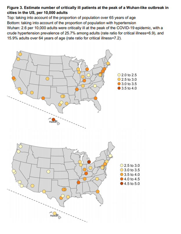
From the study, go read the study, it’s neat
The study basically uses the Wuhan contagion curve and maps it over to our “old people ratio” (top map) and our “high blood pressure ratio” (bottom map) to see how bad it might get here, in terms of infections, if we end up progressing like Wuhan did. Their worst-case mapping is 5 per ten thousand population, or 50 per 100,000, at the peak. That’s not too far off our ventilator capacity, if every ventilator was dedicated to handling coronavirus. But maybe we have that many ventilators because we need that many ventilators for other reasons.
Why was Wuhan so bad?
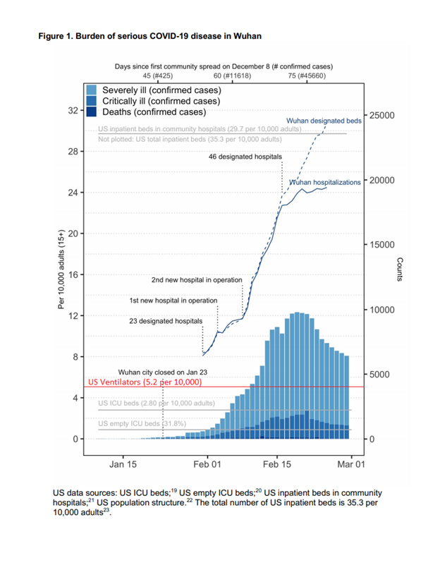
From the study, but the little red line there is mine
If the contagion curve does not get any worse than what China saw in Wuhan, we don’t exceed our national per capita ventilator capacity. But Wuhan also went into extreme lock down to manage that curve.
It was bad in Wuhan in part because Wuhan’s critical care infrastructure was a lot worse than ours is. Like Italy, their per capita resource allocation (left side Y axis) towards treatment of things like this started very low, and all those instant “just add water” hospitals we watched them build on the news were not China exceeding US capacity, they were China climbing up to meet our capacity. But again, maybe we need the high capacity we have because we’re already using it?
Perhaps our bloated healthcare infrastructure where everything is always over-treated to fleece the insurance companies for more revenue has inadvertently built in a buffer to where we can handle this? Many of the things that drive our healthcare costs up — over-treatment, treating everything as critical care, fear of being sued, cashing in on end of life care, and a fetish-like fixation on medical machinery, have pre-built an infrastructure unlike anywhere else in the world to handle COVID-19.
The numbers seem to indicate that while this is very likely going to be bad, we have more critical care infrastructure than anyone else on the planet does. This does not mean ours won’t get overburdened, but it does mean our overburden limit is significantly higher than anywhere in Europe, especially Italy. That brings us to our final question — how much burden can we take?
“Flattening the Curve,” with Numbers Finally
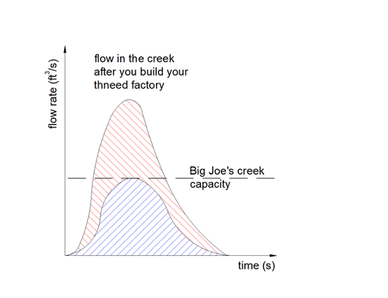
Social distancing. Flattening the curve. These are the buzzwords. A few days ago HWFO published a piece about how best to visualize “flattening the curve,” by equating it to the rain.
COVID-19 Crude Fatality Rates, Media Freakouts, and Capacity Analyses
The best way to understand this is to look at the rain.
Summarized, that corollary goes like this. If you own twenty acres of undeveloped forest land, the water runs off it into the creek next door at a rate during a storm, which is mitigated by the trees, infiltration into the soil, and such. If you pave that land, none of the water makes it into the ground, it all flows off very quickly, and the creek that used to be able to convey the flow can no longer convey it. It floods, and flooding is bad, so you mitigate this somehow. You could either widen the creek, which isn’t often done, or you could hold all the flow back in a detention pond, which releases the water slowly so the creek can convey the water without flooding.
Graphically, this:

to discover who Big Joe is, read the prior article
Turns into this:
to discover why we’re talking about Dr. Seuss, you’ll need to ask my therapist if I had one
…so you build a detention pond to prevent the flooding, and if you build it properly it turns your problem into this:
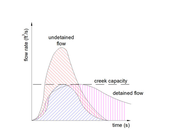
much math, very engineer
It’s a cool article. Share it with anyone who doesn’t understand “flattening the curve.”
The problem with COVID-19 is a flooding problem. Coronavirus is going to pave the land and increase the number of rain drops (infected people) who end up in the creek (medical system), and you have capacity problems. “Flattening the curve” is just doing the same thing with infected people that we did with the rain with our detention pond. Like this:
this is still unitless!
The problem, as stated prior, was that the “flattening the curve” graphs didn’t have numbers on them. None of the ones in the media do either. To understand what needs to happen, we’d have to put numbers on them. Further, we don’t know that our curve and Italy’s curve are going to be comparable, nor that Italy’s dashed line is the same as our dashed line.
A twitter thread expounding on this:
Looking closely at Italy as we did above, we discover their dashed line is basically tied to their number of ventilators. They’re in triage at 3.38 confirmed cases (maybe) per ventilator, which would lead us to believe 30% of their (identified) cases need ventilation. This is far higher than the recent JAMA Clinical Update based on Chinese numbers, which indicated approximately 5% of proven infections require critical care. This could be for several reasons, but the two most likely are that either
· Italy is underreporting actual cases by a factor of six as compared to China, due to worse testing, or…
· Italy is having a hard time matching the ventilators they have with the cases that need them
Our task in the USA is to make sure that we’re matching ventilators up with cases which need them as efficiently as possible, expand our number of ventilators, and figure out other ways we might be able to maximize ventilation, like kids or skinny people sharing a tube. (Maybe that works, maybe it doesn’t. I’m not a ventilation doctor) Raise our dashed line as high as we can, while squeezing as many people under it as possible.
We know what our dashed line looks like today. 170,000 ventilators is the line. We know what our estimated cases look like. Between 70 million and 150 million cases is the estimate. Based on JAMA estimates, five percent of these will need ventilation, which is 3.5 million to 7.5 million Americans. These are the “area under the curve” in the prior graph. We have the treatment capacity to treat between 2.2% and 4.8% of the total number of people who will need critical care at any given time.
How long someone must be ventilated is sketchy. The best information I can get currently comes from notes that MDs took in conferences that they propagated anonymously on the internet. These lead me to believe ten days is a good mean number, although I think if they had no triage-like resource restrictions they’d probably choose to do two weeks. If we take the low number, 70 million cases, and presume 5% need ventilation, that’s 3.5 million cases. At ten days each, with 170,000 ventilators, it would take 205 days to perfectly squeeze a perfectly flattened, perfectly square “curve” through that ventilation pipeline. For the 150 million cases scenario, it takes 441 days.
A perfectly efficient “flattened curve,” like a big rectangle that starts tomorrow and rides the system’s capacity until everyone is treated, would probably treat everyone in around a year, depending on the breaks. That’s not going to happen though. We have no idea what our infection curve is going to look like, but if we take Wuhan’s infection curve, and scale it up to the “70 million cases” estimate, this is what we get:
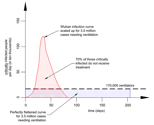
Yay we finally put numbers on Greta Thunburg (and everyone else’s) graph
How did I draw this? First, I picked scales for each axis and drew out a “perfect (rectangular) curve” to treat all patients from a 70 million case individual outbreak in the USA, for which 3.5 million need ventilators. That’s in blue. Then I traced the general shape of the Wuhan outbreak, and scaled it vertically until the area under it (which represents cases, in red) matched the blue area. If our outbreak follows a profile like Wuhan’s, we are likely to see 70% of critically infected people not get treatment.
Maybe Wuhan isn’t the right curve to use. Here’s a Gaussian distribution, a “bell curve,” for comparison, with a longer time to completion.
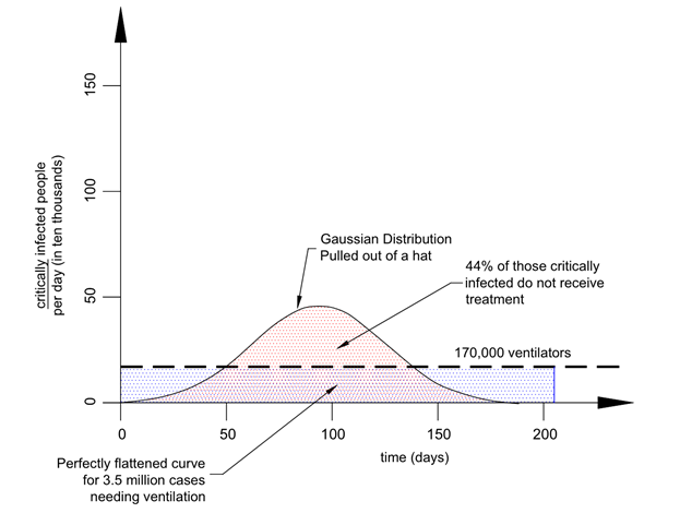
this still sucks
There’s no good way to know whether our infection curve is going to be steeper and uglier than Wuhan, or flatter and nicer, but the chances it gets under the 170,000 ventilator threshold are probably close to zero. It seems very likely to me that the United States will be in triage mode like Italy is now, if not in the late spring then certainly the summer, depending on how well our “social distancing” and voluntary quarantine measures work. And this is likely to happen no matter what sorts of governmental policies are laid out today, at any level. Social distancing and voluntary quarantine/isolation will help the problem, but will not solve it.
Conclusion
My father told me something on the phone today. He said that responsibility is a function of authority, not a consequence of blame. In his words, “if the bulldozer breaks down because the operator doesn’t change the oil, the dozer doesn’t get fixed by blaming the operator.”
If things proceed like I think they will, and the country is as divided as I see it, lots of very angry people are going to be blaming each other for something that is probably impossible to stop. Every new ventilator that gets built in the next two months might save a dozen people. Every other improvement to the critical care infrastructure that happens in the next two months might have a similar effect. Every attempt to squash this curve might mean someone catches coronavirus in November instead of June, which might mean they get treated when they might not have otherwise. But it’s highly unlikely that anything can prevent people we [may] know from dying in triage. People are not only going to die from this thing, they’re [some of them are] going to die because a doctor chose to save someone else. Probably with good reason.
I’m telling the older, more infirm family members of mine to voluntarily quarantine themselves when ICUs are a week away from being full, and stay that way until treatment capacity opens back up.
150 claps

WRITTEN BY
Following
Conscientious objector to the culture war. I think a lot. Mirror: www.freakoutery.com writer at: www.opensourcedefense.org beggar at: www.patreon.com/bjcampbell